STUDENT MAGAZINE
The things you can do with Blogger...
Blogger is a website that enables you to share posts, information, images and videos with followers and friends. It is a good way of passing on work and information. It can be personalised so depending on if you are using it for social reasons you may want to personalise your blog so that it relates to you. You can blog as a group so different people can contribute to one blog. Whatever you want to do Blogger is easy and simple to use with a variety of options. Many features included are things like picture sharing, video and voice sharing, customising design and you can post on the go. Blogger is an internet based site making it more accessible. You are able to get on it at home, on smart phones or at college. This makes it better for updating your work/ blog as you can do it on the spur of the moment or whenever you feel like- allowing a better pace for you to work at.
Task 1 (b)
How will Blogger be useful for my coursework?
Blogger is user friendly which is very helpful for my coursework as it will be easy to upload bits of work I have done and present it in the best possible way.
Blogger will allow my coursework to be more creative and personalised. It will enable me to get the most out of my work and research and explain my work and thought processes in depth.
Blogger is an alternative way to present coursework but it makes it easy to update, change and be more creative. Because it is online it is easy to access from home, smart phones and college. It means that work can be done at a better pace instead of having to wait for your next media lesson.
Task 2 (2)

Heat is a very popular weekly ‘celeb gossip’ magazine. It has a particular style that always appeals to its regular customers. The iconic masthead makes it easy to recognise along with its front-page layout.
The target audience for this magazine is young women. The age range would be around sixteen to thirty, this is because most of the stories included are based around celebrities of the same age. Stories are also more colloquial and general which would appeal more to a younger age range as its easier to understand and not very sophisticated. They are likely to be lower classes as the stories are very simple, colloquial and easy to read- this will also mean that it will appeal to busy people as it easy to read on the go.
Heat magazine uses a lot of different techniques to appeal to its target audience. One main feature is that celeb gossip is widely advertised on the cover, to attract the audience. Supposedly ‘breaking news’ is made the main feature on the cover so that the target audience know what to expect inside and it is attention grabbing. The cover is also crammed with information, stories and images. This will largely appeal to the target audience as it suggests that they are receiving lots of gossip for the money they are spending, they will believe they are getting a lot of news and information if the cover is filled. The large images will also appeal to the target audience as it is a visual aid for the text, which helps explain what’s inside. By featuring well known celebrities on the cover it will make the target audience believe that they have got the best information and also these celebrities are most likely to be current role models who the target audience will be interested in and look up to.
Heat magazine uses different conventions of design to appeal to its target audience. One main convention is the large Masthead. This is the same on every issue as it is a brand, seeing this every week will appeal to the target audience because it gives a sense of familiarity and allows the audience to know that they are receiving the product they expect. The Plugs and Puffs also appeal to the target audience because they add extra information and allow the audience to know what is inside the magazine, prompting them to buy. They also make the cover more interesting and make it look full, to give the impression there is a lot of information inside. The main image is also enlarged so that it stands out and lets the audience know exactly who/ what the story is about.
Heat magazine uses lots of different features to appeal to the target audience, whether it is stories or design conventions. Using familiarity is always strong point because regular customers will feel confident buying a product that is regular and familiar. This also creates a brand within the gossip genre meaning that the target audience will know what to expect and will specifically come to heat if they are looking for a ‘celeb gossip’ magazine.
Task 3(1)
Find 5 examples of magazine covers for magazines aimed at teenage girls. Study what seem to be the conventions of this genre of magazine.
These magazines mainly use female celebrity role models as the main image. This is so young fans will want to read the magazine as their favourite role model is on the front and featured inside.
Many of the plugs are about romance; fashion; make-up and self image. This largely appeals to teenage girls who are growing up and want to know more about these areas.
They all use very feminine colours, fonts and styles. These are all used to emphasise who the target audience are and to attract them. Using bright pink, for example, is more likely to attract to a female audience than a male one.
 Cosmo girl: The main image is Taylor swift who is a popular figure and a big role model among young girls. The Red and Black colour theme is slightly more edgy and could link to the slightly ‘rebellious’ plug about Taylor Swift which discusses ‘Love, Success and Revenge’. The colours could also be trying to appeal to a more mature audience instead of using pinks and purples, which are more likely to attract a younger audience.
Seventeen: The main image is Ashley Tisdale who is a major figure and role model for younger girls as she has appeared in films and programmes aired on Disney Channel. Using Ashley Tisdale implies that the main target audience is younger girls but this thought is conflicted by the plug topics which feature ‘Fashion, Beauty and Body Tricks’ and ‘Get Hot Abs’. The majority of the font stands out because of the block, thick font used. The core colour theme running through the magazine is yellow and pink, which are very feminine and would appeal to a younger audience.

Teen Vogue: This cover features Mary-Kate Olsen. The plugs are also more appropriate for the target audience of young girls and this is supported by Mary-Kate being on the cover. The Red and Pink appear to cancel each other out and is quite over used, so doesn’t stand out. Although the black font used for some plugs do stand out against the bland pink and red.
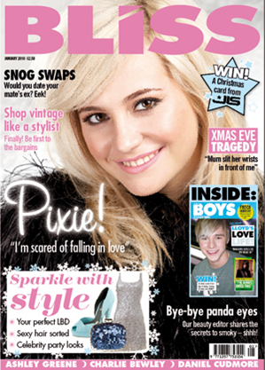
Bliss: Bliss has a more understated style using pale colours. Pixie Lott, a very popular star at the moment, is the main image and stands out as she is wearing darker colours. The target audience is probably quite mature as the plugs discuss ‘snog swaps’ and ‘party looks’. This cover is understated but stands out effectively because of images and font and appeals well to the target audience.

Task 3 (2)
To what extent should magazines be held responsible for the social ramifications of the representations they offer?
Teenage magazines regularly publish information that is too sophisticated for its target audience and it could be believed that this plays a major role in why younger girls are growing up too fast. It could also be believed that magazines offer information that could make an impression on its audience and people believe that the magazine should be held responsible for this.
Magazines should be held responsible for the social ramifications because it is them supplying the representations. Teenage magazines print information that many people do not think is suitable for the audience that are actually picking up and buying the magazine. Magazines are aware of who is purchasing their magazines so should consider what representations they are portraying. The magazines need to accept that they can’t always discuss more mature topics or present a representation when they know their target audience aren’t ready for that type of information. Magazines should be held responsible to a large extent because if they didn’t publish particular representations it would be harder to find out about them and understand them, meaning audiences aren’t influenced and find out information at a more suitable time/ age and can form their own ideas instead of being influenced by a printed representation. If magazines are making representations accessible they shouldn’t stand back and claim no responsibility. Magazines come up with their own opinions and ideas so a certain representation in a magazine could be influenced by a personal thought, meaning that a representation is misleading. Magazines should ensure that they are being non-biased as they have the power to change opinions.
On the other hand magazines are too divided; you go from children’s magazines, with toys in, to teenage magazines which are trying to access older teens. Because of this young teenagers of around 13 ends up purchasing the older teen magazines because there isn’t a magazine particularly aimed at them- this shouldn’t stop older teen magazines printing information for their target audience. It could also be thought that just because a magazine publishes something, it may not be for the particular consumer who picks up the magazine and it should be the parent/guardian controlling what younger readers are purchasing. There is also the argument that magazines have the right to have their own opinion on something and shouldn’t be held responsible for the social ramifications because people don’t actually have to buy their magazine. The magazine can’t help who ends up purchasing their magazine. Magazines are also responding to supply and demand. They are only printing information and forming representations because that’s what the audience want. If the audience didn’t want to hear about certain representations then the magazine are unlikely to print them. Magazines shouldn’t be held responsible for the social ramifications formed by representations that the audience want to hear about.
Overall I believe, Magazines should be held responsible to a large extent for the social ramifications for the representations they offer. They are putting the representations out there and need to consider who is actually going to pick up their magazine. Magazines are very influential and need to ensure that they aren’t having a biased view on anything because readers, especially young ones are going to be influenced by this and have an impression made upon them, which could lead to a social ramification.
Task 4
IPC Case Study
Types of Magazines:
IPC has been related to a range of different types of magazines and target audiences over the years. From women’s fashion magazines to Men’s magazines and sport magazines. IPC has and still does produce some of the most iconic media brands in magazine publishing.
IPC is the creation of various magazine publishers merging into one company. This means that in the various magazine companies histories there have been a range of titles over the years. For example Country Life and Horse and Hounds were launched in the 1800’s. The 1900’s saw the launch of women's magazines with ‘Women’s own’ and the most iconic music magazine NME.
Now a days IPC focuses on a smaller selection of genres which are more specified to certain Target Audiences.
Target Audiences:
Over the years, where IPC has had a range of magazines the target audience has been very wide spread. In more recent years IPC has started to channel their target audience in to 3 main groups.
· Men
· Mass Market Women
· Upmarket Women.
Men’s publications include wealth and leisure brands like Rugby World, Horse and Hound, Nuts and NME.
Mass Market Women and the more gossip genre like Look, Now and Chat and the Upmarket Women magazine genre includes more expensive brands like Marie Claire, Women and Home and essentials.
New Music Magazine
IPC would be a good company to produce a new music magazine because of their history and association with the genre. They publish one of the most iconic music magazines, NME, so clearly know what the public want and how to design and brand a music magazine.
IPC clearly have had experience in the music magazine genre so would be a good company as they have the right contacts, ideas and designs to make a successful magazine.
On the other hand though IPC may not be a great company as they have had the association with NME so may be too NME orientated and may not be able to come up with or control a unique idea and could be at risk of making another magazine very similar to NME.
Genres:
The genre of music that IPC are most likely to drift towards to is ‘punk’, which is very similar to NME, as they have experience here. But they may also be likely to create an ‘indie’ magazine as this is a very popular music genre and quite simple to create.
The type of genre magazine IPC might create is a women’s gossip magazine or a home life magazine. This is because they already have successful brands in this genre and know that they do well and are successful.
Alternative Publishers:
Other and alternative publishers may be more appropriate as they have different and more upcoming ideas.
Bauer has more than 80 influential titles and would be a good alternative publisher as they have more current titles that make a lot of money. They have more popular titles too. IPC has a lot of older titles that aren’t as popular anymore. Bauer has TV Choice and Heat which are very popular current magazines, which do sell every week, they are more popular than magazines like ‘Horse and Hound’.
IPC may be too set in it’s way to produce a new and fresh magazine and a more current publisher may be needed to ensure that the new magazine is a hit.
Skills Audit
Using a Computer

Taking Photographs

Using Applications
Skills Audit
Using a Computer

Taking Photographs
Using Applications
Preliminary Brief
Initial Ideas
· Use natural colours, like browns, blues and greens so that text stands out.
· Use an image of a student. Have them posing with a folder or college work and have them smiling to show that college is a positive thing.
· Large, bold font for the heading.
· Use shapes to surround the plugs to make them stand out.
· Ensure the image is in certain place so that I can fit the plugs in easily and make sure they can fit in without being cramped.
· Use other images to support the plugs so that there are visual aids and not just one image.
· Consider the target audience and make sure the image is appealing to them.
· Make sure the plugs are also appealing to the target audience- talk about upcoming events at college.
· Use different design techniques to make the magazine more appealing.
Proposal
I am aiming my magazine at students and other people who are thinking of coming to college after school. I will be aiming my magazine at this audience as they are the audience who will benefit most from the content of the magazine.
My magazine will be all about life at South Downs College, detailing upcoming events and discussing past activities and giving a general overview of what is happening at college.
The title of my magazine is going to be ‘South DC’ as I want it to be blatantly obvious what my magazine is about and the audience it is targeting.
My cover lines will detail competitions, upcoming trips, major stories featured inside and exciting events for students, which are detailed inside.
The fonts I am going to use for my cover lines will be bold and simple so that they stand out, attract attention and are clear and easy to read. For example; 'Arial Bold', and may be to be slightly unique ‘American Typewriter’. The Masthead maybe slightly different and have more detail on so that it looks unique and stands out against the simple cover lines.
My magazine will be published in the Autumn Term in the run up to Christmas, detailing upcoming trips and Christmas events and to explain college life to new students. It will help them to get a feel of college life and inform them of trips they can attend with/ or to meet new people.
My magazine will be published weekly, to keep up to date and to provide a constant supply of information for students. Although there may not be many new articles to publish there will at least be some format of the magazine released weekly. There will also be a special edition each month or at the very least every half term which will be more detailed with an over view of events that month or half term.
The image on my cover will be of a student either enjoying college life or posing with her equipment to give an accurate depiction of what college life is like. I will get this by taking images while around college or by asking a genuine student to assist me outside of college time.
I would colours and images used on my contents page will reflect South Downs, White, Blue and Green colour scheme or Browns and Oranges to represent autumn, when my magazine will be published. Images may be based around the college site or students at college. The font will be clear and follow the South Downs College colour scheme. The font and overall layout will be clear and easy to read/ understand and navigate.
Flat Plans


I made 3 different flat plans as a way of thinking how to layout my front cover. These flat plans will help me when taking my picture as I will know what type of layout I want therefore will position the image to fit this. It will also save me time when I actually start to put my front cover together as I will have a basic pattern to follow.
MUSIC MAGAZINE
Research Tasks:
1) Questionnaire and Results:
2) Target Audience Case Study:
3) Music Magazine Analysis:

4) Conventions of Music Magazines
I have looked at various music magazines and have found some common aspects and conventions of magazines.
Conventions of Magazine Covers:
- Use Bold, Clear Headings
- As the headings are usually well known they may be covered by the main image
- Contrasting colours are used on plugs to make them stand out
- Pull Quotes
- Cover lines
- Cover stories
- Attention Grabbing through placement of content-things are put into certain places to draw the eye
- Stick to a similar ‘brand’/ style through out all magazines
- Images
Conventions of Magazine Content:
- Within the magazine the same style is carried through out with a similar colour scheme
- In interviews pull quotes highlight key features to attract attention
- Captions
- Eye Catching Colours
- Images
- Page numbers
Overall a magazine will have a certain style/ brand that is used continuously through out every issue. By looking at range of magazines I’ve been able to identify the main conventions which mainly lead to ‘intense’ focus on the celebrity and making sure that the audience are being captured by the bold features of the cover. Inside, every page is followed through the same with similar style. Text is normally laid out in columns, with pull out quotes included so that audiences can scan and see the main features. Main images of articles attract attention too and all images through out the magazine are striking. Most of the content in the magazine is interviews and reviews of concerts and albums and full of information on the latest band and solo artists. They also start to incorporate other things like technology; for example tweets and websites that make magazines much more accessible and relatable to audiences.
Initial Ideas:
- · Large, clear heading
- · Use Bright Colours
- · Focus on Whites and Purples as a colour scheme
- · Central image- A musician that is dressed in the colour scheme- to blend in.
- · Have clear and eye catching plugs with supporting images
- · Clear barcode
- · A professional look
- · Focus on inside stories in the plugs
Magazine Content:
- § Genre: Pop/ R&B
- § Link inside activities/ stories to friends/ family (due to questionnaire results)
- § Interviews with artists
- § Mainly aimed at the female market through colour schemes and topics
- § Exclusive Stories
- § Competitions
- § Latest News (Link to ‘Tweets’)
Proposal:
My music magazine is mainly aimed at female teenage music fans in the 16+ age range. The magazine will be aimed at this audience because the content of the magazine will be based around current artists that will appeal to that particular age range.
My magazine will be about current music trends and music news, based around new album releases and the activities of popular artists. It will include reviews on concerts, festivals and new album releases and will have interviews from the latest music celebrities and will even link into to Twitter to get as much information as possible.
The title of my magazine is ‘Note’, in reference to a musical note. The title will be clear so as to attract the audience attention easily. I will use a unique font to make sure that it stands out against the normal cover lines. The cover lines will detail the content inside, advertising the main features like interviews and competitions. The main image will be of a solo artist and will stand out by using a bold stance and bold colours and will positioned to ensure maximum effect.
The magazine will be published monthly will all the latest news of that month. It will be monthly so that there is enough information to fill a whole issue and so that more things can be covered. It will be priced around the £2.30 mark as it is published monthly but still needs to be affordable for the target audience.
The contents page will continue the theme and format of the cover making sure the look of the magazine is professional and together. There will be an editors noted addressed to the reader just talking about anything exciting or special the readers should be aware of in the issue. The contents page will have a list of all the articles inside and will have images that are related to this as a visual aid. The contents page will be easy to navigate and be clear so that readers can use it efficiently and quickly.
The double page spread will be an interview with an up and coming artist. The title will be clear and striking in order to catch the audience’s attention before they turn the page and the main image will be after the text so that the text is read first instead of just scanning the image. The layout of the text will be clear, in columns, to ensure an easy read but will be segregated by a few pull out quotes which should attract the audiences attention before they start reading.
Overall my music magazine will talk about the new and upcoming music trends that will be applicable to young audiences. The layouts will be clear cut an old to ensure easy use and to make sure the audiences attention is grabbed at every opportunity.
Flat Plans:
I I planned some flat plans to give me a rough idea of my layout for my contents, cover and double page spread. I also made these flat plans to use as a guide when actually constructing the pages.
I I planned some flat plans to give me a rough idea of my layout for my contents, cover and double page spread. I also made these flat plans to use as a guide when actually constructing the pages.
Cover:-


Contents:-


Double Page Spread:-

Examples of Photography
I had a range of examples of my photography so that I could choose what images would work best in my work and would work best at representing my audience and my magazine as a whole. Below are a few examples of the type of photos that I took:
I had a range of examples of my photography so that I could choose what images would work best in my work and would work best at representing my audience and my magazine as a whole. Below are a few examples of the type of photos that I took:


