DRAFT COVERS
Draft Cover Page
This is my first cover draft. I started by inputting the image and title to see where I could fit my coverlines, barcode and price. I also feel that I need to change the colour of the title as it is too boring and doesn't stand out enough. I will also need to input some images and coverlines to make the cover more interesting and more like a music magazine.
This is my second draft of my cover. I have progressed a lot from the last cover, as I have now added some coverlines, a barcode and images at the bottom to support coverlines. I am a lot happier with this design and will keep this brief outline to work around until I am completely happy. There are some areas that I need to change. I need to change the colour of the 'Exclusive Interview" as it isn't very prominent. There are also some small things missing that would make the cover 100% complete and a lot more like a music magazine, one of these being the price and issue number.
My third draft, is getting a lot closer to being 100% complete. I have added the Issue number and changed the colour of the "Exclusive Interview" to make it stand out more. I am happy with the way this cover is heading and there are a few more tweaks to be made to make it complete.
Here is my fourth draft, the final one before the completed cover. I have moved the "Exclusive Interview" in order to use the space better. I have also added an arrow in order to make the cover more colloquial. I'm not completely sure about these changes though as it doesn't really speak 'music magazine'.
Draft Contents Page
This is my first contents page. I have used a sticky note around the Editors Note to make the page quirky and interesting. I have images down the side to support the pages listed and a clear list of the pages inside the magazine. I have a lot of changes to make as this contents page seems very plain and simple. I think I need to add more colour and also need to make sure I add page numbers so that the contents page is as useful as possible.
This is my second contents page. I have only made some minor changes here, by adding in page numbers for a start and also highlighting the 'top stories'. I have added in a bracket as well as 'top stories' to add detail to the page. There are still some minor changes that need to be made though.
This is my third and final draft. I have made some more changes, like changing the colour of the title to make it stand out more and be more interesting, but also to make it more like a music magazine. I have also added a border around the list of pages, to complement the slight borders around the images to the right hand side. I still feel some minor tweaks need to be made to make sure the page is 100% perfect and coincides well with the cover page.
Draft Double Page Spread
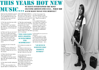
This is my first draft of my double page spread. I have put the image of the right hand side so that the audience will see the text first, instead of just skipping straight to the image. I have copy and pasted the text over from my word document, that I typed up earlier, and it unfortunately does not fill up all of the space, so this will need to be changed. I have also added two pull quotes, which the colour of coincide with the title.
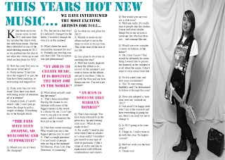
In my second attempt at my double page spread, I have added more text, but it still doesn't fill the space, so once again this will need to be changed. I have also changed the colour of the pull quote so that the page is more interesting, but I made sure it also went well with the title and didn't clash. I have also noticed that the bold text below the title overlaps across the page which means some of it will be lost it the pages were to be printed and put in a real magazine. I will have to edit the page and move it around a bit to make sure that the everything fits in ok.
This is my final attempt at a double page spread draft. I have finally filled up all the space with text and moved the text that overlapped between the two pages so that the layout of the page works out better. I have also made the first letter of the article bigger so that it looks more like an authentic page of a music magazine. I feel that there still need to be some changes made so that there is a common theme and style running through all the pages.
FINAL COVERS
This is the final version of my Cover Page. The changes that I have made here are adding a price, and page numbers and I have also made the first letter of the title 'Note' slightly bigger. I have done this to make it look more authentic, and in addition to this I have put a thin pink outline around the title to make it more defined and stand out even more.


